One of the most important projects that comes to mind for SEOs when it comes to crawl budget optimisation and improving topical authority is content pruning.
Content pruning refers to the process of removing, merging, or updating low-value or low-traffic content, which helps reduce the volume of poor-quality pages.
The challenge, however, is that content pruning projects are often faced with various difficulties such as identifying pages that can be removed, finding those that need off-page actions or content updates, managing the risk of traffic loss, convincing stakeholders, and more.
In this article, we aim to explain the content pruning process step by step, examine common challenges, and provide practical solutions for executing it effectively.
This article is a guest contribution from Liam Lesani, SEO Team Lead at Welltopia.
Approaches for Content Evaluation
When we want to start a content pruning project, we come across several different methods for evaluation. In the following sections, we will go through all of them and finally decide which one suits our case best.
Manual method
In this method, we usually check everything manually for each URL, such as traffic, publish and update dates, content quality, and so on. We then make the necessary changes right away and store the results in a tool like Google Sheets or Excel.
The main problem with this approach is that it is not scalable. Even if we want to apply it to a medium-sized website with at least ten thousand pages, it becomes practically impossible.
Another issue is that aside from the time it takes, the outcome can be quite subjective. This is especially common when it comes to evaluating content quality. If a team is responsible for this process, things get even more complicated, and the likelihood of human error across the workflow increases.
LLM-based & Pythonic method
Another approach for content evaluation is using LLMs and Python, which can work well if implemented correctly, but it usually comes with several challenges.
Some of the main challenges include:
- It requires advanced technical knowledge, especially when it comes to scaling. You cannot just rely on tools like Cursor; you need a solid understanding of NLP, how LLMs work, and concepts like embedding models, vector operations, semantic similarity, pipeline orchestration, and more.
- High computational costs when scaling, particularly if you want to use multiple LLMs.
- LLM bias in scoring and the difficulty of setting thresholds and decisive logic.
- And more.
If I were to summarise the key advantages briefly, they are:
- High semantic understanding
- Reduced risk of mistakenly removing pages that may have high value but currently receive little traffic
- Ability to automate at scale
- Capability for learning and fine-tuning to improve results over time
It is generally recommended to use this method alongside the data-driven approach for content updates and merging.
Data-Driven Method
One of the biggest fears SEOs have about large-scale content pruning is traffic loss after the pruning process. This fear usually stems from two main reasons. The first is accidentally deleting pages that actually receive traffic, and the second is a drop in topical authority, which can lead to ranking declines and ultimately lost traffic. In such situations, only a data-driven approach can help because:
- The risk of accidental deletion is eliminated, and even if we remove pages with low traffic, we have a realistic view of the overall impact.
- The volume of pages we plan to remove from various topics and categories can be fully assessed. We take this into account in our care plan to ensure that topical authority is not compromised.
The next fear is facing stakeholders and convincing them. This often happens when you have done a manual review, but stakeholders such as a marketing manager or content marketing manager may not approve the pruning project. At this stage, you need to present data to persuade them to give the green light.
In the following sections, I will walk you through, step by step, building a data-driven pruning framework.
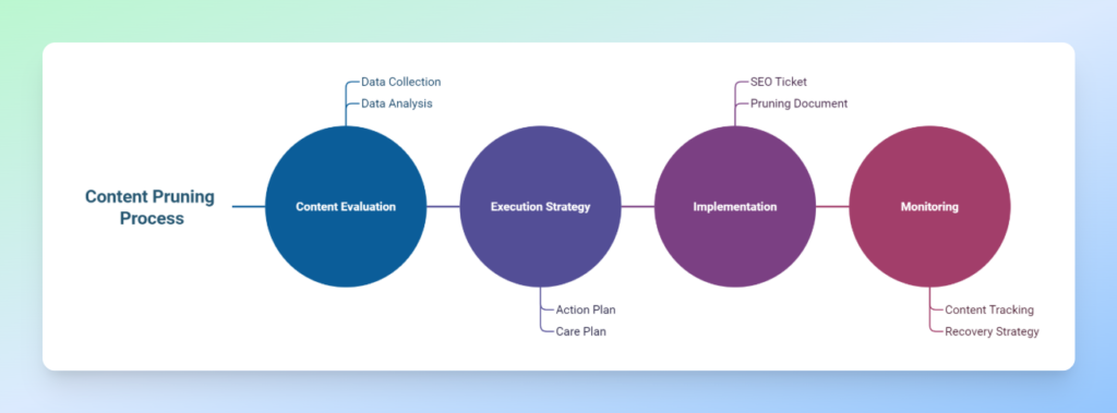
Data-Driven Content Pruning Process
1. Content Evaluation
This stage consists of two main parts: collecting data from sources such as GSC, GA, and others, and analysing the data based on various metrics like clicks, impressions, and more. We then define scoring and ranking for the content to get a clear view of its performance.
2. Execution Strategy
This stage also has two main components: the action plan and the care plan. In the action plan, we define precise actions for each page, such as keep, prune, update, check, or improve. In the care plan, we estimate potential traffic loss if we plan to remove pages that currently receive traffic, identify topics, design a new content strategy, and take measures to minimise traffic loss while ensuring our topical authority within each topic is not harmed.
3. Implementation
Coordinate with the technical team to carry out the project. At this stage, it is recommended to prepare a comprehensive document outlining your concerns, the data, and other relevant details, and submit a clear SEO ticket to the technical team.
4. Monitoring
Keep track of the content you have decided to retain so that, in case of any ranking drops, you can quickly design a recovery strategy if needed.
Building a Data-Driven Pruning Framework
One of the main reasons that motivated us to create a framework for content pruning is that it allows us to establish an organised system that not only saves us time but also ensures we don’t miss anything.
Over the past few months, I’ve worked on several content pruning projects and realised how much having a structured approach can speed up and simplify content analysis. For this reason, I decided to create a comprehensive Google Sheets template to make my work easier in future projects.
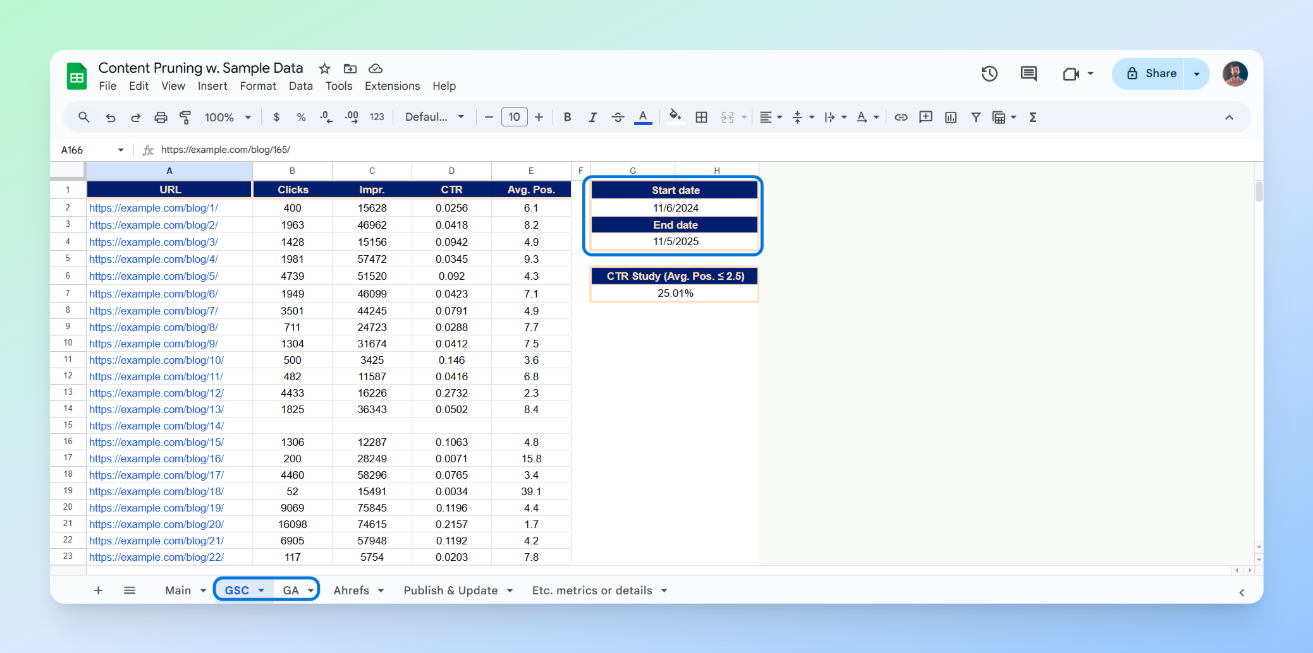
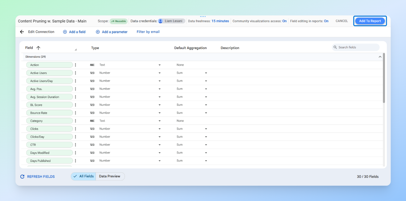
Our spreadsheet template generally includes six sheets:
- Main: Gathers all data in one place and includes scoring, and flags
- GSC: Google Search Console data with metrics such as clicks, impressions, CTR, and average position, plus start and end dates for calculating clicks and impressions per day
- GA: Google Analytics data with metrics such as active users, new users, bounce rate, page views per session, and average session duration, plus start and end dates for calculating active and new users per day
- Ahrefs: Ahrefs data with metrics like URL Rating and referring domains
- Publish & Update: For retrieving the published and modified date of each post to identify outdated content
- Etc. Metrics or Details: For adding any new metrics or details that may be required for each project
Explanation of the Scoring Metrics, Flags and Actions
As I mentioned, in addition to the main metrics, we also have three scoring metrics and three flags that we want to use for more accurate ranking and identification of our content. Let’s quickly go through them.
Scoring metrics
GSC Score: (Clicks per Day × Impressions per Day) ÷ Average Position
By multiplying clicks and impressions, we capture both visibility and engagement. Dividing the result by the average position normalises the score, giving more weight to pages that not only appear frequently but also rank well.
GA Score: [New Users per Day × Page Views per Session × (Average Session Duration × 24)] ÷ Bounce Rate
This metric evaluates the quality of traffic and on-site engagement using GA data. A higher GA Score indicates a page attracts new, highly engaged visitors who interact with multiple pages and spend more time on the site. This score helps identify top-performing pages in terms of user behaviour and engagement quality.
BL Score: ½ × [(UR ÷ max(URs)) + (RD ÷ max(RDs))]
UR: URL Rating, RD: Referring Domains
This score measures the relative authority of a page based on its backlink profile. Each page’s strength is normalised against the maximum observed values in the dataset, ensuring a fair comparison. The ½ coefficient balances both components, authority and referring domain count, equally.
Flags
We have three flags in total, each calculated as true or false. Outdated applies to posts where the modified date is over a year old, Underperforming applies to posts ranked above position 20 with a CTR below one percent, and Opportunity applies to posts in position 2.5 or better where the CTR is below the CTR Study. By CTR Study, we mean the average CTR for positions equal to or better than 2.5.
Actions
In general, five actions have been defined, which you can adjust according to your needs:
- Prune: Prune content that has zero daily clicks and a daily active user count of one or fewer. We can either redirect it to related pages, set it to no-index, or delete it so that it returns a 410 status.
- Update: Refresh content that has fewer than 5K daily impressions, an average position below 4, and a CTR of one percent or less. This action is aimed at improving the ranking of pages with low competition that already hold a reasonably good position but have poor CTR.
- Check: Review content with more than 5K impressions, an average position below 3, and a CTR lower than the CTR benchmark (CTR Study). In this category, the content is highly competitive and already ranks well, but its CTR is below the expected average and needs a thorough investigation to identify the cause.
- Improve: Focus on content with more than 5K impressions and an average position between 3 and 10. These are highly competitive pages where performance has been average, preventing us from reaching the top three positions. We need to examine these pages to understand and address weaknesses.
- Keep: Content that does not fall into any of the categories above. No changes will be made to these pages.
How It Works
Our workflow is very simple. Just add data into the GSC, GA, Ahrefs, and Publish & Update Sheets, and enter the URLs in the Main Sheet. All other metrics will automatically populate using formulas.
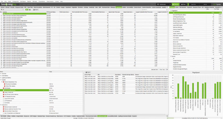
Using the Screaming Frog SEO Spider API Access
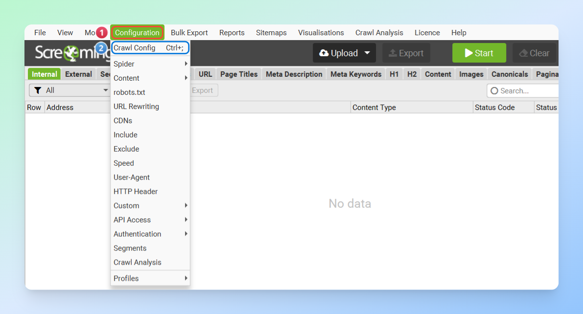
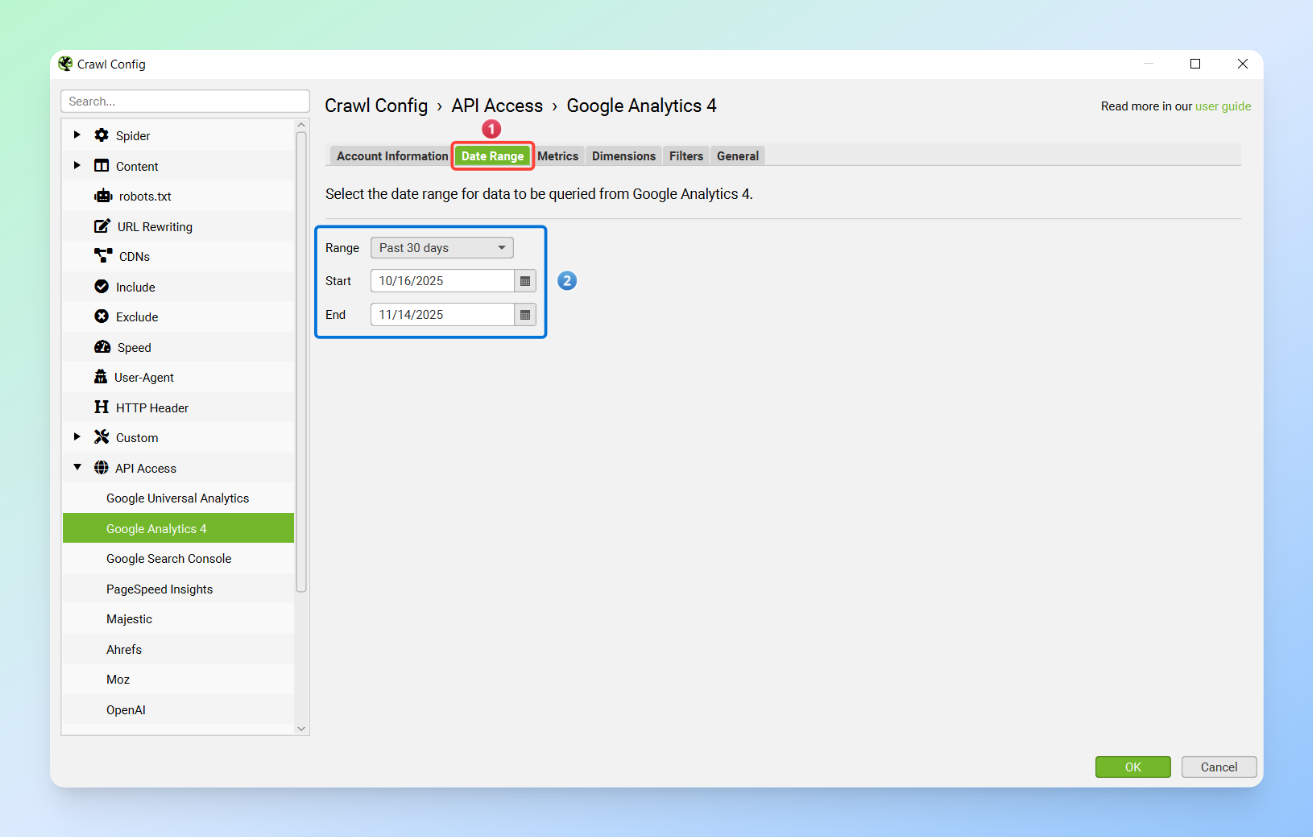
For data collection, one of the easiest methods is using the Screaming Frog SEO Spider’s API Access, which allows you to gather data from various sources effortlessly. All you need to do is go to Configuration > Crawl Config > API Access and connect the APIs of the different tools to the SEO Spider.
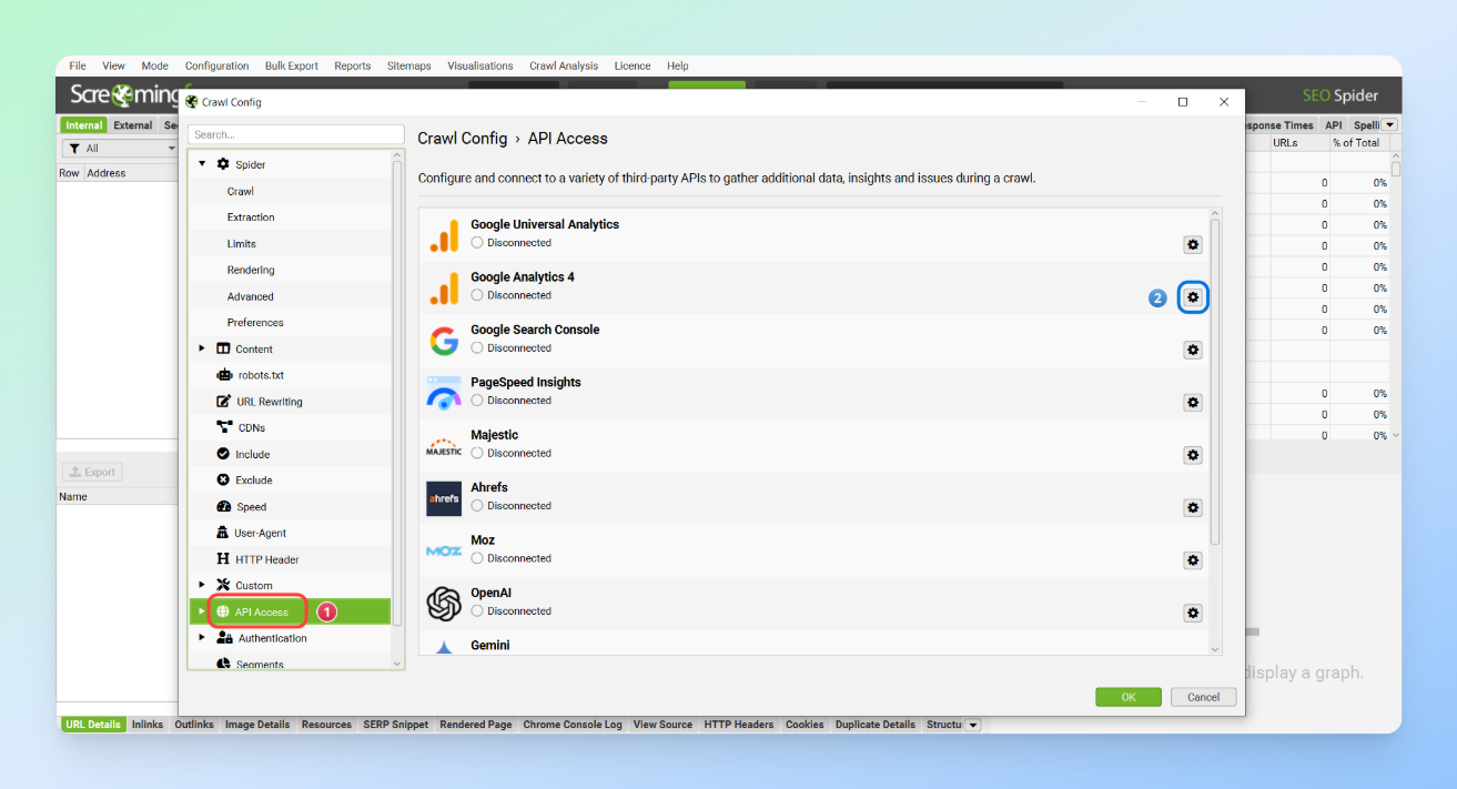
If you haven’t used this feature before, you can easily learn how to connect each tool through the links below.
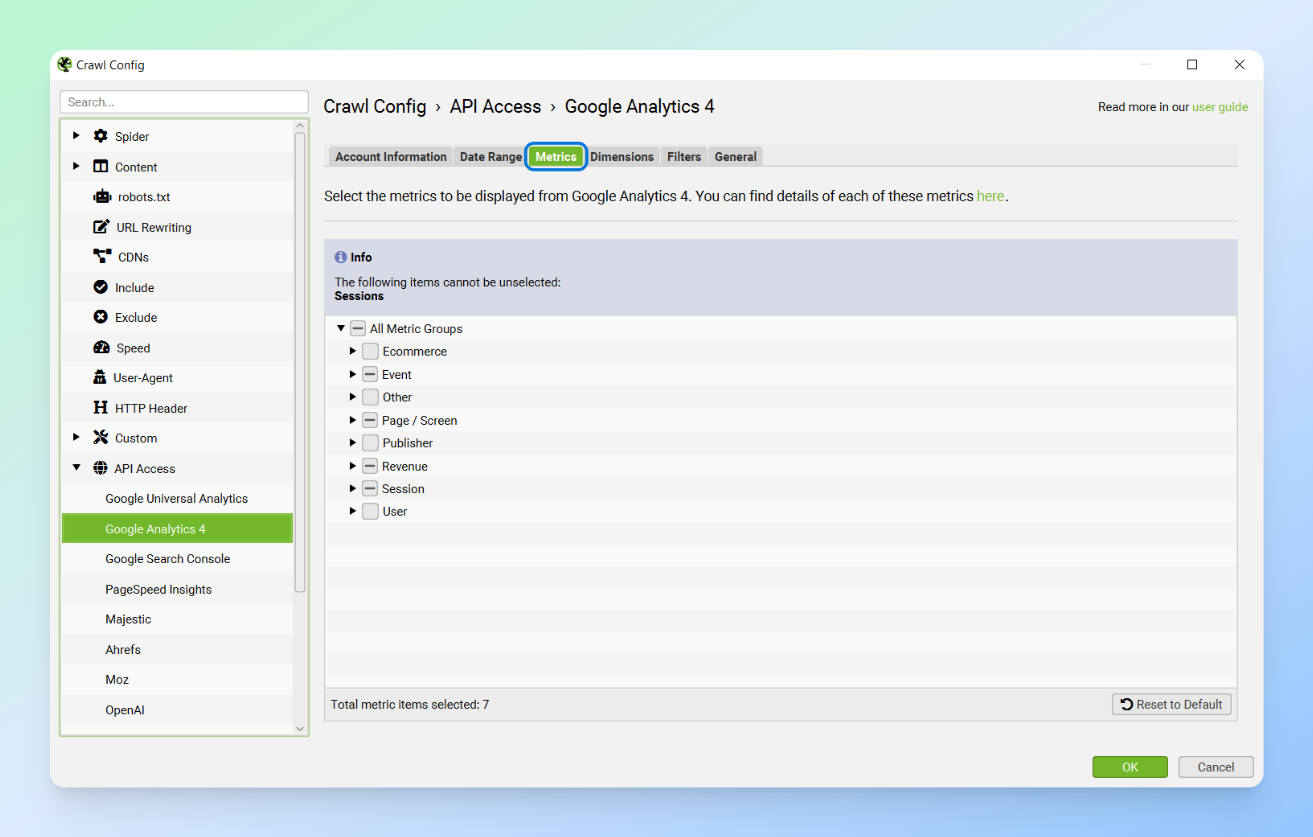
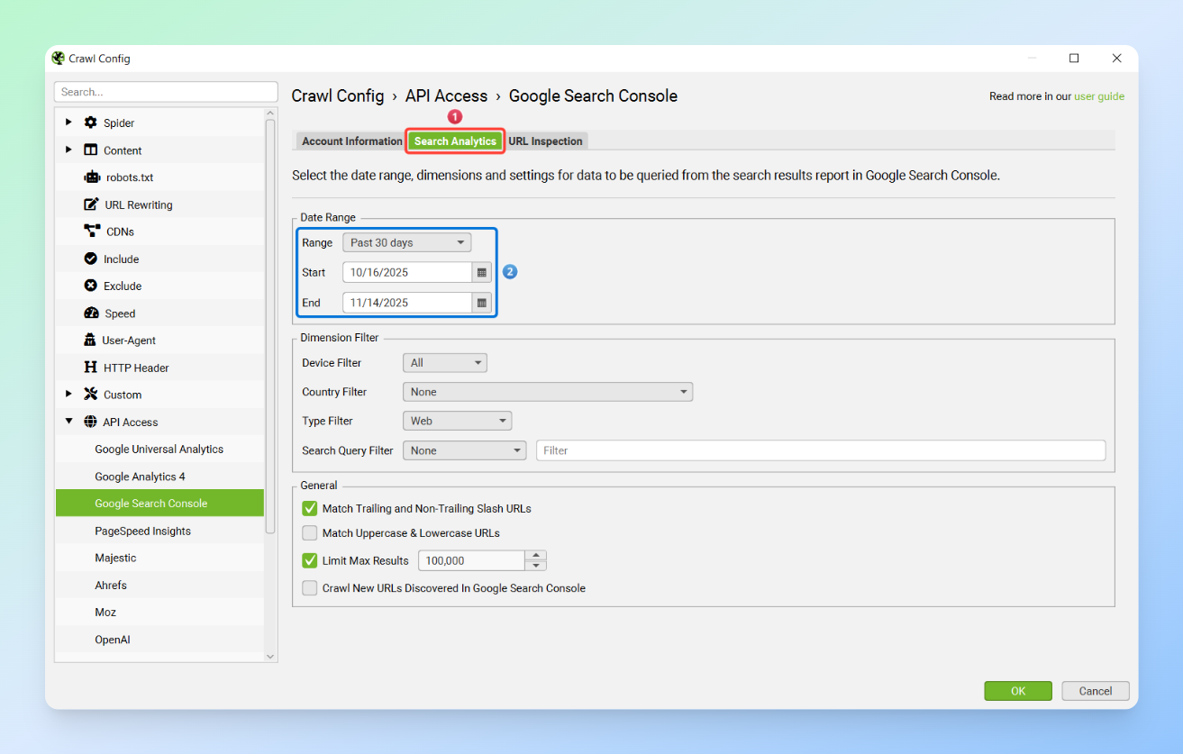
In the next step, you need to select the metrics you want from the Metrics section for each tool and set your desired date range.
Tip: Preferably, the data dates for GSC and GA should match. If GA was inactive for the chosen period or only a shorter range is available, make sure to document this in the final document and dashboard you plan to create.
Next, set the SEO Spider’s Mode to List and enter your list of URLs. Then, export the data from the Search Console and Analytics sections and transfer it to your content pruning sheet.
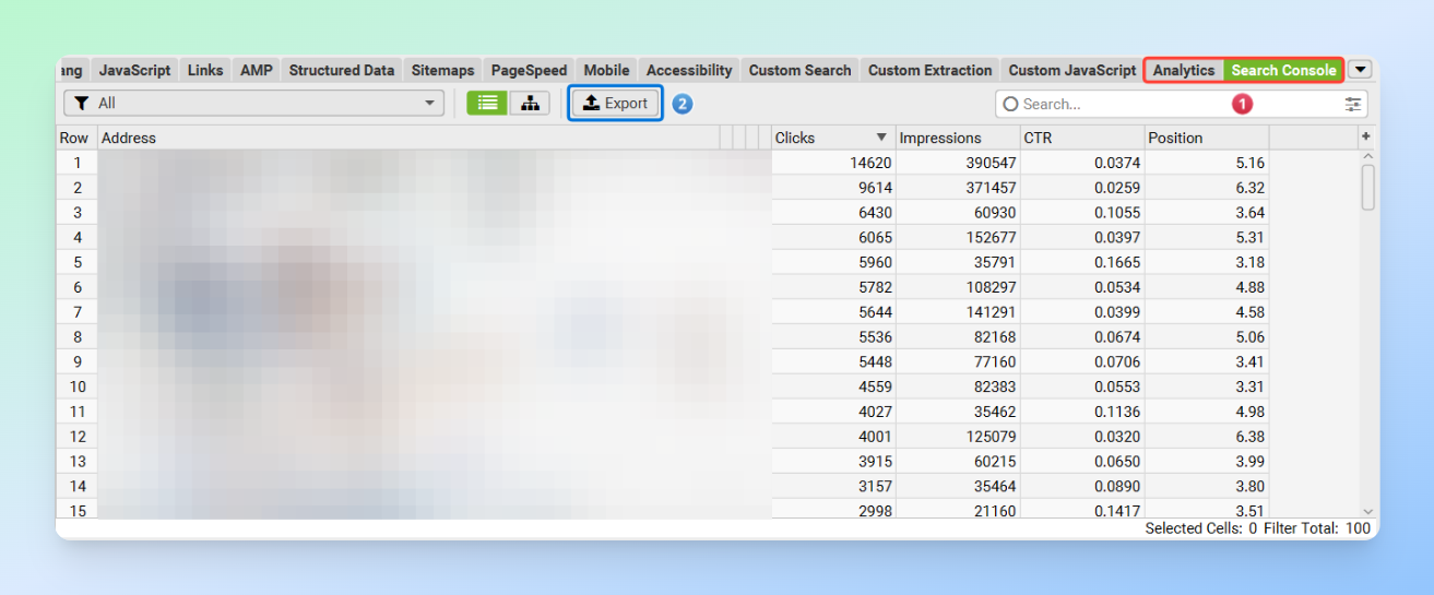
Note: Make sure that the start and end dates you use in the GSC and GA Sheets match the dates you entered in the API Access settings in the SEO Spider.
Finally, enter the list of URLs in the Main Sheet so that all the data is imported automatically.

Common Mistakes
- Pruning based solely on three months of traffic and ignoring seasonal content (ideally, use a full year of data)
- Ignoring internal links to pruned pages, which wastes crawl budget
- Failing to monitor pages after pruning
- Over-aggressive pruning and not having a care strategy, which can damage topical authority and lead to traffic loss
- Failing to simplify and visualise data for stakeholders, which often causes the project to stall
- Not creating comprehensive documentation for the entire project
- Writing an inadequate SEO ticket and providing unclear explanations to the technical team
Best Practices for Data-Driven Content Pruning
- Exclude posts from the past 30 to 45 days to reduce noise in your data. These posts may need more time to gain rankings and generate traffic.
- Always use multi-source data and avoid pruning content based solely on GSC.
- Content freshness often differs from the post’s modified date. Even a small change, a single sentence, or a random update can alter the modified date, so it is better to carefully review your final prune list.
- Monitoring is a crucial part of the pruning process. After pruning, make sure to keep the retained content under observation for one to two months.
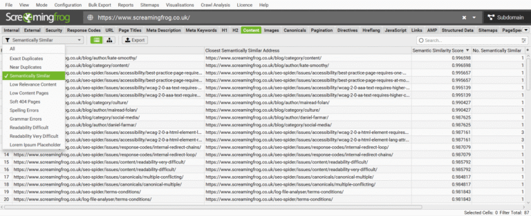
- When pruning content, make sure the pages are removed from all locations. Otherwise, they will waste the crawl budget. For example, if you want to remove Page A, any links to Page A on Pages B and C should also be removed. This can be easily checked using tools and the Inlinks report in the Screaming Frog SEO Spider, which allows you to export your internal links and verify that the pruned links are no longer present on destination pages.
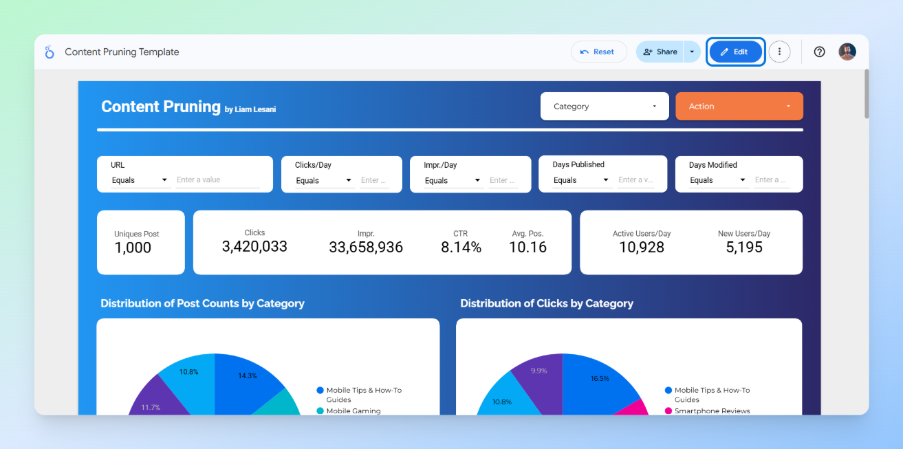
Visualising Insights in Looker Studio
Visualising data not only gives us a clear overall view, but it is also a powerful tool for communicating with and persuading stakeholders. Relying solely on a table in Google Sheets makes it difficult to convey exactly what is happening and what our goals are.
Additionally, in a platform like Looker Studio, you can create interactive dashboards and customise everything. You can easily use filters and controls, and accessing the data becomes much simpler and more convenient.
The good news is that you don’t have to create visualisations from scratch. There is a pre-designed dashboard that you can easily customise and add any other elements you need based on your project.
How to Use the Ready-Made Looker Studio Template
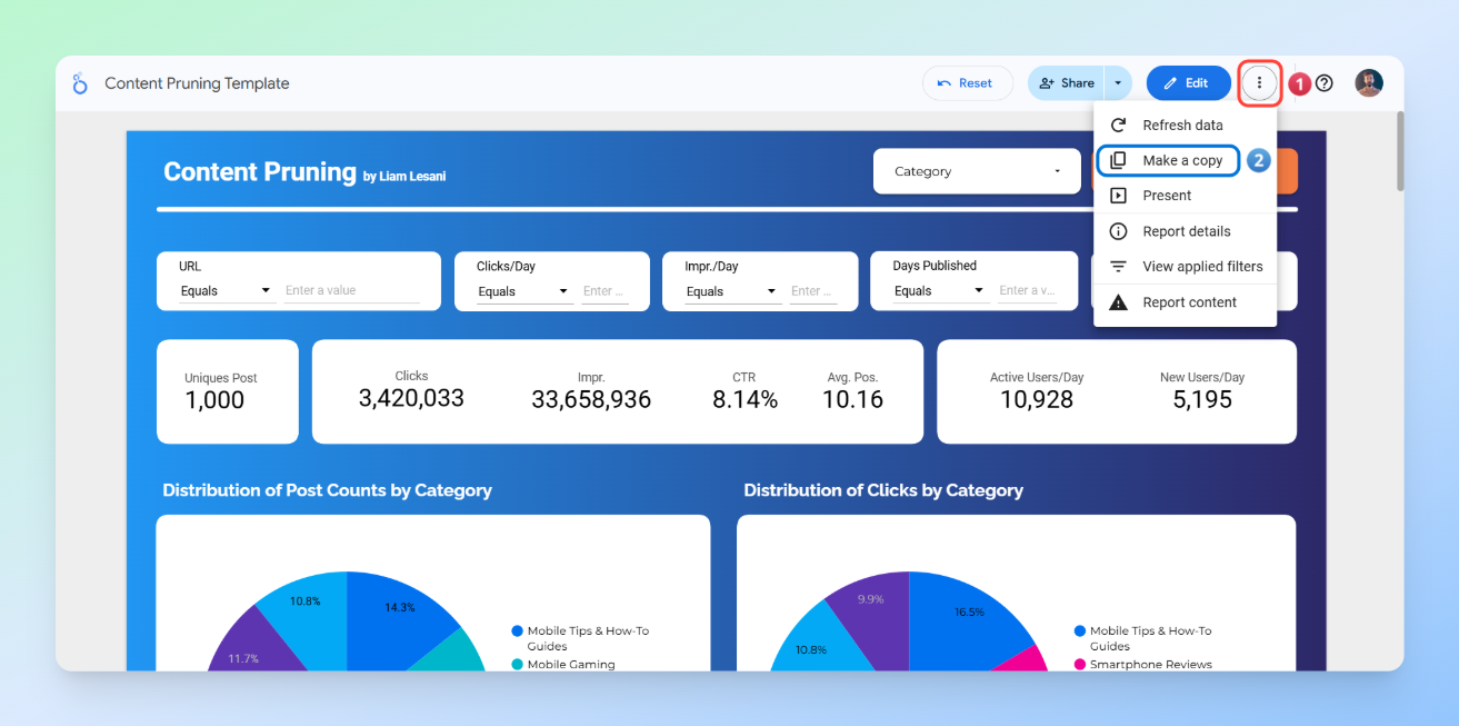
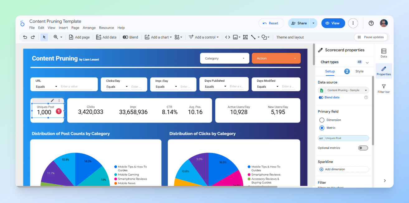
Step 1: Copy the Looker Studio template
As shown in the image, click on the three dots in the top-right corner, then select Make a copy.
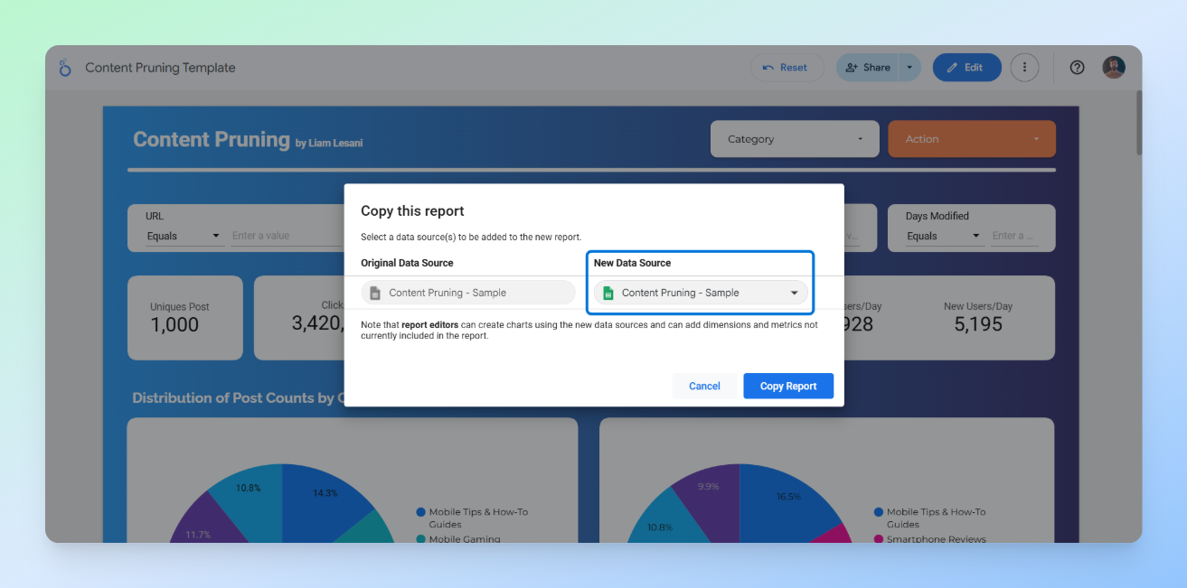
Step 2: Replace the sheet
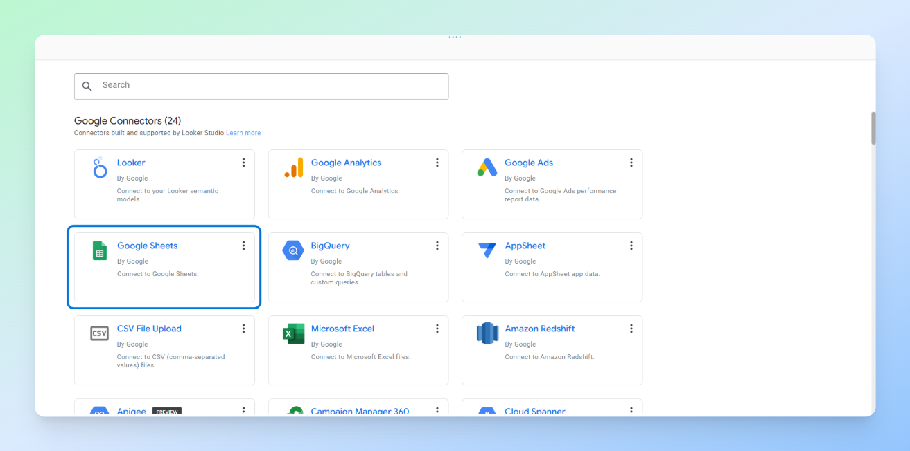
First, just like in the images, click on New Data Source and then select Create Data Source.
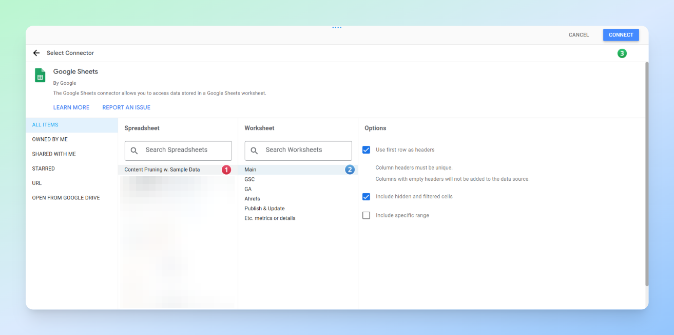
Next, the list of Looker Studio connectors will appear. Find the Google Sheets connector and click on it.
After that, locate the sheet you want, then in the top right corner click Connect, followed by Add to Report so your data source is added.
Finally, click on the Copy Report button.
Step 3: Customise the dashboard
Click the Edit button in the top-right corner, then click on any table or section to customise it according to your needs.
Best Practices and Tips for Creating a Dashboard
When customising a dashboard or creating a new one from scratch, there are a few key points to keep in mind.
Identify Primary Users and Their Concerns
Who are you presenting this data to, and which metrics matter most to them? Are you only presenting to the SEO team, or will it also be shown to people with less SEO knowledge?
Answering this question helps prioritise which metrics should be displayed and how they should be presented in each section of the dashboard. For example, if you are creating a dashboard that needs to be presented not only to the SEO team but also to the marketing manager to persuade them, then in addition to metrics like clicks and users, metrics such as orders and NMV generated from these pages will also become important.
The Importance of How Metrics Are Displayed
The next step is deciding how to visualise these metrics so they have the most impact and are easily understood by your audience. For example, for the marketing manager we mentioned earlier, where should the NMV data be placed on the page?
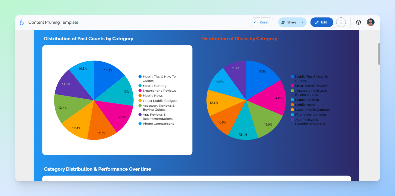
In general, it’s better to display key metrics at the top of the page as a scoreboard rather than just as a table at the bottom. Based on experience, busy stakeholders prefer to see overall achievements or losses first before diving into the details. This way, you can immediately show that the pages you plan to prune not only have low clicks but also low business value.
Readability and Appropriate Use of Colours
The appearance of your dashboard, readability of the data, and proper use of colours are critical. Poor design can make your work look unprofessional, affect the first impression, and reduce engagement with the dashboard. It can also cause confusion.
For example, look at the image below. The right side of the image is completely unreadable and unclear. When this happens, the person we are presenting the dashboard to will struggle to engage with it properly.
Common Mistakes in Visualisation
- Ignoring the concerns of the people the data is being presented to
- Poor presentation of metrics, which can even lead to misunderstandings
- Failing to provide details at the end of the dashboard or on a separate page
- Using inappropriate or excessive colours
- Too much information in one view, for example overloading charts with excessive data, making it hard for users to focus on what matters
- Ignoring data hierarchy and layout, failing to guide the eye from the most important insights to supporting data
- Lack of interactivity or guidance, such as providing static visuals without filters, tooltips, or explanations, which limits users’ ability to explore the data and discover insights
Conclusion
Content pruning is often a delicate balancing act between optimising crawl budget and managing the risk of traffic loss. In this article, we have provided a concise yet comprehensive framework to help you navigate this process using a scalable, data-driven approach.
By leveraging the strategies and templates shared here, the aim is to give you the confidence to make informed decisions and the data needed to secure stakeholder buy-in. We hope that this guide and the accompanying resources prove useful for your future projects.
If you have any questions, thoughts, or new ideas on the subject, we would very much appreciate hearing them in the comments below.
The post Data-Driven Content Pruning at Scale Using APIs and the Screaming Frog SEO Spider appeared first on Screaming Frog.