
Your sales funnel is bleeding money.
Every day, potential customers enter your funnel, and somewhere along the way, they disappear.
The question isn’t whether you’re losing potential customers, it’s how many and where.
Sales funnel analysis helps you find these leaks and fix them.
When done right, it can boost your conversion rates without spending any extra budget on ads.
Start by mapping your funnel stages
Before you can analyze anything, you need to understand what you’re actually measuring.
That starts with defining the stages of your funnel – not based on some textbook model, but based on how people really buy from you.
Define the funnel stages that matter
For most businesses, the stages look something like this:
- Awareness: People discover your brand.
- Interest: They engage with your content or visit key pages.
- Consideration: They explore solutions, compare options, or request a demo.
- Purchase: They become customers.
- Retention: They buy again or upgrade.
Define what each stage means for your business.
- For B2B, consideration could mean downloading a whitepaper or signing up for a webinar.
- In ecommerce, it might be adding items to a cart or viewing product reviews.
The key is to map your funnel based on actual behaviors that impact revenue, not vanity metrics.
Set up proper tracking
Once you’ve defined your stages, make sure you’re tracking them.
- Use UTM parameters for campaigns.
- Install proper analytics code.
- Ensure your CRM talks to your marketing tools.
Without clean, connected data, your analysis will be worthless.
Don’t rush the mapping process
Mapping your funnel stages is the most important part.
It’s the foundation of every insight you can extract, so spend some extra time on it.
Everyone knows the standard funnel.
It appears in nearly every marketing slide deck, webinar, and presentation, but it’s overused and rarely tailored to how your business actually works.
Your funnel starts where the customer journey does
The marketing funnel typically starts with user awareness and acquisition.
Think of YouTube or Demand Gen ads in PPC, or social ads to build awareness.
Win customers with search and shopping ads further down the funnel.
From there, your sales funnel begins – often on a category or product page.
At this point, the details start to matter.
- What do users see first? What catches their eye?
- If they add to cart, what happens next – does the cart build trust, or cause friction?
- Is there an upsell? Are key payment methods clearly available?
- Is checkout smooth and distraction-free?
- And after purchase – do you follow up with emails or review requests?
The customer journey can be as simple or as complex as you make it.
You can look at top-level metrics for quick insights or dig deeper into your:
- Ad setup.
- Landing pages.
- Content.
- Trust signals.
- Reviews.
Eventually, top-line numbers won’t be enough, and a deeper dive becomes necessary to move forward.
Dig deeper: PPC keyword strategy: How to align search intent with funnel stages
3 ways to analyze your funnel
1. Conversion rate analysis
This is your bread and butter. Look at how many people move from each stage to the next.
If 1,000 people visit your pricing page but only 50 request a demo, your conversion rate is 5%.
Calculate these rates for every stage, then compare them across different traffic sources.
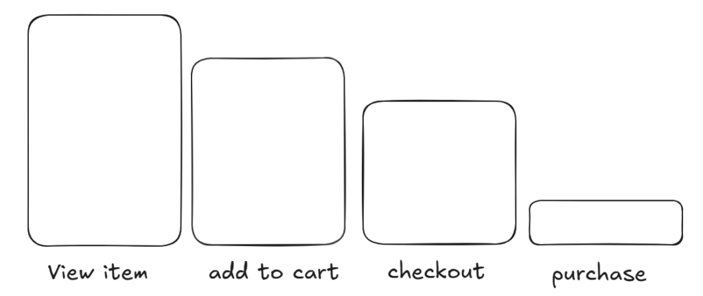
For ecommerce: Focus on the biggest drop-offs
A standard ecommerce analysis might start from the product page, when the user:
- Views an item.
- Adds it to the cart.
- Goes to checkout.
- The purchases.
Focus on the steps with the largest user drop-off.
Following the Pareto (80/20) principle, the biggest impact is usually found there.
This example is tailored for shopping traffic, such as Google Ads or Microsoft Ads.
However, if you’re analyzing other traffic sources, such as SEO, the user journey might start from a category page or even the homepage.
For social traffic, the path can look different again.
Always run your analysis with respect to the traffic source, as the on-page journey will vary.
Putting everything in one basket rarely leads to meaningful insights.
For lead gen: Funnel complexity varies
Conversion rate analysis for e-commerce is relatively straightforward.
For lead gen projects, it’s often more complex.
Some setups use a structured multi-step funnel. Others rely on a single landing page with a contact form.

For multi-step forms or funnels, track the entire journey – from the landing page through each step until conversion.

If you’re working with a one-page landing page and a simple contact form, focus on user interaction signals instead:
- Was a video watched or clicked?
- Was a certain scroll depth reached?
- Was a downloadable asset accessed before submitting the form?
One-step landing pages are trickier to analyze.
That’s where heatmaps can help uncover where users engage – or where they don’t.
Tools like Microsoft Clarity or Hotjar are especially useful here for spotting friction points without needing multi-step tracking.
2. Drop-off analysis
Find where people leave your funnel.
Check your analytics for pages with high exit rates or forms where users abandon halfway through. These are your problem areas.
Focus on the largest drop-offs first.
If most users bounce between your homepage and product pages, fix that before diving into checkout optimization.
Prioritize the leaks that cost you the most money.

In the example above, the biggest drop-off happens after an item is viewed, before it’s added to the cart.
Everything after “add to cart” has strong conversion rates, which means in-cart products are being purchased – but getting people to add an item to the cart is the core issue.
Once you identify a major drop-off point – like the product page – use heatmaps to understand what’s happening.
Again, Microsoft Clarity is perfect here. It’s free, integrates with GA4, and is easy to use.
When reviewing a product page, make sure it covers key trust and usability elements:
- High-quality product images.
- Reviews and social proof.
- “People also bought” or “related products” sections.
- Clear navigation and breadcrumbs.
- Variant selectors that work smoothly.
- Shipping info (especially if it’s free).
- Bundles or upsells.
- Contact/support visibility.
- Payment options.
Naturally, the product still needs demand and a competitive price.
But if you’ve checked those boxes and conversions are still low, a heatmap can reveal behavioral clues.
Maybe users are:
- Getting stuck in a certain section.
- Clicking where nothing happens.
- Or abandoning after interacting with the variant selector.
These insights can highlight problems before you run A/B tests – saving you time and narrowing your focus.
3. Cohort analysis
Track groups of users over time.
For example, compare people who signed up in January to those who joined in March.
This helps uncover seasonal patterns and long-term trends.

Cohort analysis reveals how user behavior changes based on when they convert.
- B2B customers often behave very differently from B2C.
- Business users typically sign up Monday through Friday during work hours – they’re researching on company time and often go through approval processes.
- You might see your highest B2B conversion rates midweek, from Tuesday to Thursday, when decision-makers are most focused.
- B2C customers, on the other hand, tend to convert better on weekends.
- They have more time to research personal purchases without work distractions.
- You may find your strongest signup rates from Friday evening through Sunday.
Different industries follow different seasonal patterns:
- SaaS for accountants might see spikes during tax season.
- Fitness apps often peak in January.
- Ecommerce tends to follow retail cycles – back-to-school in August, holiday shopping in November, and post-holiday in January.
The right breakdown can surface highly actionable insights. For example:
- Users who start trials on weekends might convert 30% better than weekday signups.
- Customers acquired through webinars may stick around longer than those from cold outreach.
Looking at performance by signup date, acquisition channel, or behavior over time gives you more than just vanity metrics – it helps you optimize timing, targeting, and retention.
The right tools for the job
You don’t need expensive software to start. Here’s what actually works – and when to use it.
Analytics platforms for funnel tracking
Most basic funnel analysis starts with your analytics tool.
To find out where users drop off, use:
- Google Analytics 4.
- Adobe Analytics.
- Piwik.
- Matomo.
- Or simpler options like Plausible.
Just set up conversion goals and use funnel reports to track the customer journey.
Most of these tools integrate well with platforms you’re already using.
CRM systems for post-lead insights
To see what happens after someone becomes a lead, you’ll need a CRM, such as:
- Salesforce.
- HubSpot.
- Pipedrive.
- Zoho.
Just make sure your system tracks deal stages and source attribution.
The goal is to understand which marketing efforts actually drive revenue, not just leads.
Event tracking for deeper funnel insights
For more advanced needs, specialized tracking tools give you a closer look at user behavior.
Mixpanel and Amplitude are great for event tracking and segmentation, especially if your funnel is complex.
For simpler setups, tools like Heap or Kissmetrics offer solid alternatives without the same learning curve.
Behavior analysis tools for on-page insights
To understand why users drop off (not just where), use heatmaps and session recordings.
Hotjar and Microsoft Clarity show how users interact with your pages:
- Where they scroll.
- Where they click.
- Where they hesitate.
Don’t over-tool: Start with what you need
Before subscribing to a stack of tools, ask yourself what insights you actually need.
In most cases, a combination of Google Analytics 4 and Microsoft Clarity can cover 90% of what matters.
Paid tools only make sense when you’re working with larger datasets or need more granular reporting.
The key is to connect your tools so you see the entire customer journey, not just fragmented touchpoints.
Dig deeper: How to implement a full-funnel PPC marketing strategy
Get the newsletter search marketers rely on.
MktoForms2.loadForm(“https://app-sj02.marketo.com”, “727-ZQE-044”, 16298, function(form) {
// form.onSubmit(function(){
// });
// form.onSuccess(function (values, followUpUrl) {
// });
});
Analytics reports you need to know
Use these reports to uncover how users move through your funnel and where they get stuck.
Funnel exploration
This is your go-to for analyzing multi-step journeys.
Set up funnels that reflect your actual flow – from landing page visit to email signup to purchase.
Segment them by traffic source, device, or user type to uncover patterns.
For example, separate funnels for mobile vs. desktop can reveal where each group struggles most.
Path exploration
Funnels show the intended journey. Path exploration reveals what users actually do.
Use this tree graph to spot surprising paths and friction points.
You might discover that high-converting users visit your pricing page before the demo – not after, as you’d assumed.
Cohort exploration
Track user groups over time based on signup date, campaign, or channel.
You’ll often find that some sources drive users who stick around longer, even if their initial conversion rates are lower.
Perfect for analyzing retention and lifetime value.
User explorer
When data looks off, dig into specific user sessions.
Sometimes, a handful of power users skew your averages, or edge cases reveal friction points.
Use this tool to understand the why behind anomalies.
Segment overlap
Compare different user groups – like email subscribers vs. social followers, or new visitors vs. returning buyers.
The overlaps often reveal your highest-value segments, so you can double down on what’s working.
Use reports to answer specific questions
The key isn’t browsing reports. It’s asking the right questions. For instance:
- “Why do mobile users convert 40% worse than desktop?”
- Use funnel exploration by device.
- “Which blog posts generate our best customers?”
- Use path exploration to trace their journey.
Once you’ve built these explorations, save them so you can monitor changes over time.
Funnels evolve, and these reports help you catch shifts before they hurt performance.
Dig deeper: How to optimize PPC forms and follow-ups for lead gen in 2025
Turn data into insights
Numbers alone won’t improve your funnel. You need to understand what they mean and why they’re happening.
Segment everything
Don’t trust topline conversion rates alone. Break your data down by:
- Traffic source.
- Device type.
- Geography.
- Customer characteristics.
A 3% conversion rate might be excellent for cold Facebook ads, but underwhelming for email traffic. Context matters.
Spot the patterns
Use data to identify trends that point to underlying issues:
- Poor mobile conversions? You might have a responsive design problem.
- Slow enterprise sales cycles? Your process might be too complex.
- Blog posts driving high-quality leads? Double down on similar content.
Look for recurring signals that tie performance back to experience, intent, or channel quality.
Identify the bottlenecks
Most funnel problems come down to just a few stages.
- Maybe your landing pages get plenty of traffic but few trial signups.
- Or maybe trials convert well, but no one reaches the signup form.
Prioritize fixes based on impact.
Start with the biggest drop-offs and address them before optimizing elsewhere.
Take action and keep improving
Analysis means nothing without action. Here’s how to turn insights into results.
- Prioritize by impact: Fix the changes that will drive the most revenue first. A 2% lift at your biggest drop-off point beats a 20% gain in a low-impact stage.
- Test your improvements: Don’t just make changes and hope they work. A/B test new landing pages, contact form steps, and checkout flows. Small tweaks can create big results, but only if you measure them.
- Monitor continuously: Set up dashboards with your key funnel metrics. Review them weekly, not monthly. The faster you spot problems, the less money you lose.
- Keep iterating: Funnel optimization never ends. Customer behavior shifts, competitors evolve, and what works now might not work next quarter. Stay adaptable and keep testing.
Your next steps
Funnel analysis isn’t a one-time task. It’s an ongoing habit.
Start with the basics:
- Map your stages.
- Set up tracking.
- Identify where users drop off.
With clean data, even small fixes – a faster checkout, clearer product info, stronger trust signals – can lead to meaningful revenue gains.
Don’t aim for perfect conversion rates. Aim for profitable growth.
Sometimes, fewer, higher-quality leads are worth more than chasing volume. Focus on the metrics that actually drive your business forward.
The marketers who consistently analyze and improve their funnels are the ones who see real, lasting results.